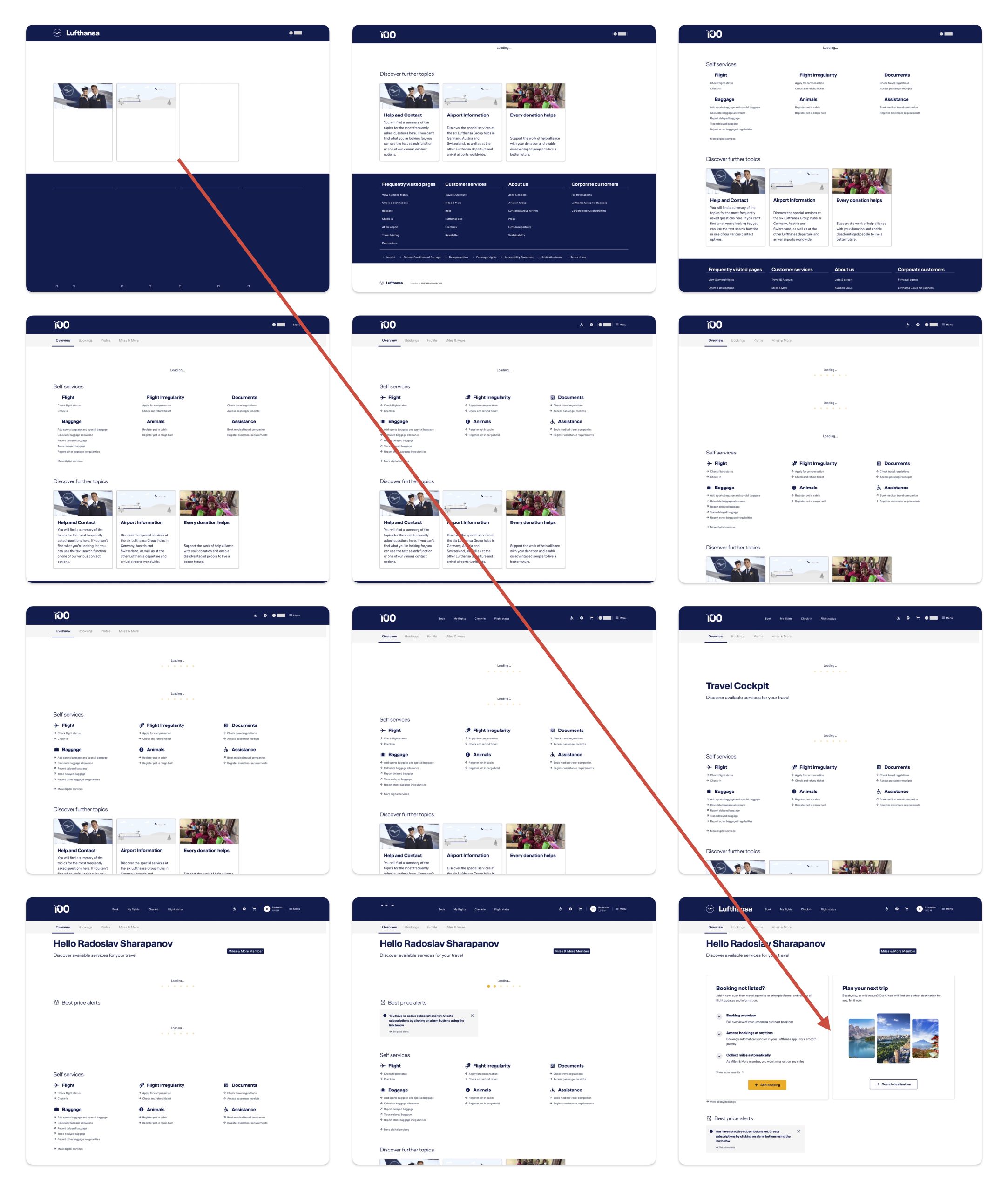
12 Frames of UI Chaos: Why Lufthansa’s Profile Page Suffers From Extreme Cumulative Layout Shift
September 21, 2026 7:22 pm Leave your thoughtsImagine trying to tap a “Bookings” button, only for a “Subscribe to Price Alerts” banner to flash into existence a millisecond before your finger touches the glass. Suddenly, you’re on an opt-in screen you never wanted to see.
This isn’t just an annoying glitch – it’s Cumulative Layout Shift (CLS) at its absolute worst. A visual breakdown across 12 sequential screenshots of the Lufthansa user profile page perfectly captures a modern frontend nightmare: elements appearing, jumping around, collapsing, and re-injecting themselves into the viewport over several seconds.
Here is a breakdown of what went wrong, why it happens, and how to fix the underlying engineering and organizational failures that cause it.
What’s Happening on Screen?
Across the 12 capture states, the layout continuously reshuffles:
- Header & Identity Mutation: The top navigation toggles from a plain logo to generic category links, then abruptly repaints to display personalized user credentials (“Hello Radoslav Sharapanov”), loyalty tiers, and search bars.
- The “Jumping” Self-Service Grid: Core utility links (“Baggage”, “Animals”, “Documents”) render first near the top, only to be violently shoved down the page as slower services finish loading.
- Injected Personalization Banners: High-impact cards – like “Booking not listed?” and “Plan your next trip” – inject themselves directly into the middle of the page layout without reserved spatial containers, causing the content below to collapse and expand repeatedly.
- Loading Spinner Fatigue: Multiple, uncoordinated loading spinners fire off independently across different sections, making the page feel like a patchwork quilt loading at different speeds.
The Technical Culprit: Distributed Micro-Frontends Gone Wild
Why does a modern enterprise website behave like this?
One possible explanation is that Lufthansa, like many enterprise applications, relies on a micro-frontend architecture. Instead of one monolithic application, different teams probably build separate parts of the page:
- Team A owns the Navigation & Auth Service.
- Team B owns the Baggage & Self-Service tools.
- Team C owns the Personalization & Marketing engine.
- Team D owns the Miles & More loyalty integration.
When a user visits the page, each component makes its own asynchronous API call. The generic static links load instantly in 100ms. The personalized marketing engine responds in 400ms. The legacy loyalty backend takes 1200ms.
Because no space was reserved on the page for slow-loading modules, every arriving API payload forces the browser to recalculate the page’s geometry – shoving previously rendered elements down the screen.
The Organizational Root Cause: Conway’s Law in Action
This level of layout shift is rarely a developer skill issue; it’s an organizational structure issue.
According to Conway’s Law, systems reflect the communication structures of the organizations that design them. When an enterprise operates in isolated silos without unified technical governance, the user experience breaks down in predictable ways:
- Siloed Performance Goals: Team B is evaluated solely on how fast their Self-Service widget loads, ignoring how its late insertion ruins the layout for Team C’s component below it.
- Lack of Design System Enforcement: No centralized authority enforces consistent skeleton screens or pre-allocated layout bounds.
- Feature Velocity over Core Web Vitals: Teams are rewarded for shipping personalized promo boxes, not for guarding the user’s visual stability.
How It Should Be Built: Technical Fixes
To achieve a seamless, flicker-free rendering experience, the frontend needs strict layout discipline:
- Server-Side Aggregation over Client-Side Stitching: Shift layout assembly from the browser to the server or edge. By fetching micro-service data on the backend and compiling the localized page into a single HTML payload before delivery, the browser renders a fully formed layout on the very first frame.
- Edge-Based Micro-Frontend Stitching: Use edge computing workers to aggregate independent micro-frontend services into a unified DOM structure. This eliminates client-side API waterfalls, isolated loading spinners, and dynamic DOM insertions that trigger layout recalculations.
- Selective HTML Streaming: For slow, low-priority backend data, stream HTML directly into pre-rendered server slots rather than injecting client-rendered components into an unreserved DOM space.
How It Should Be Managed: The Organizational Fix
Fixing the code isn’t enough – you have to fix the team structure that allowed the code to deploy.
- Establish a Web Performance Governance Team: Create a cross-functional Frontend Core team with “veto power” over releases that violate strict performance metrics (like Google’s Core Web Vitals).
- Enforce Hard CLS Limits in CI/CD Pipeline: Automate Lighthouse/LCP/CLS checks in integration pipelines. If a pull request pushes Cumulative Layout Shift above 0.1, the build fails automatically.
- Shift to Experience-Centric Metrics: Stop measuring teams on isolated API speed. Measure feature teams on Total Page Stability and customer interaction metrics.
The Bottom Line
A user interface shouldn’t feel like a game of musical chairs. When micro-services operate without strict design guidelines and layout orchestration, technical complexity leaks straight into the user experience. By enforcing strict layout reservation, leveraging server-side aggregation, and breaking down engineering silos, enterprise platforms can deliver fast, personalized content without making their users dizzy.
Categorised in: Works
This post was written by rado